For the 2026 season, we have completely rebuilt the Analytics tab for all new maps. The part of the map where the real number crunching happens, this tab had grown significantly over the years, having to adapt as events changed and new features were added.
The newly revamped version builds upon these foundations, but goes much further than the old Analytics tab, bringing much more insight into the data. A host of new sections have been added, with a few older ones retired. The new version is far more powerful, interactive and in depth.
More insight
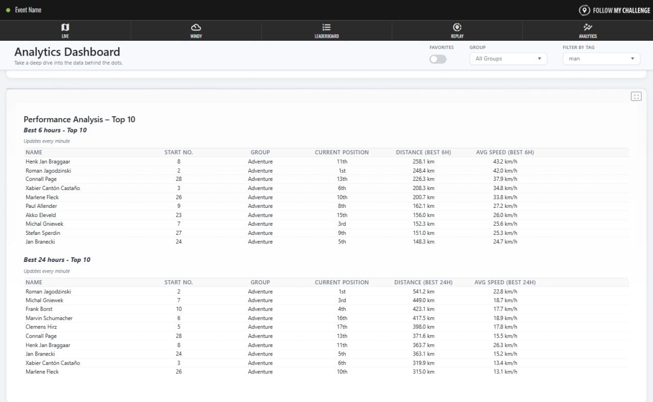
The new Analytics tab introduces a range of new metrics, allowing you to dig deeper into the data than before. The addition of recent progress, performance analysis and checkpoint gain/loss tables allows users to hone in on the data that is of interest, highlighting recent trends, key performances and notable changes in position.
The aim of these sections is to bring to life the data that the leaderboard is missing, allowing for a far greater understanding of how the event is playing out.
Better filtering
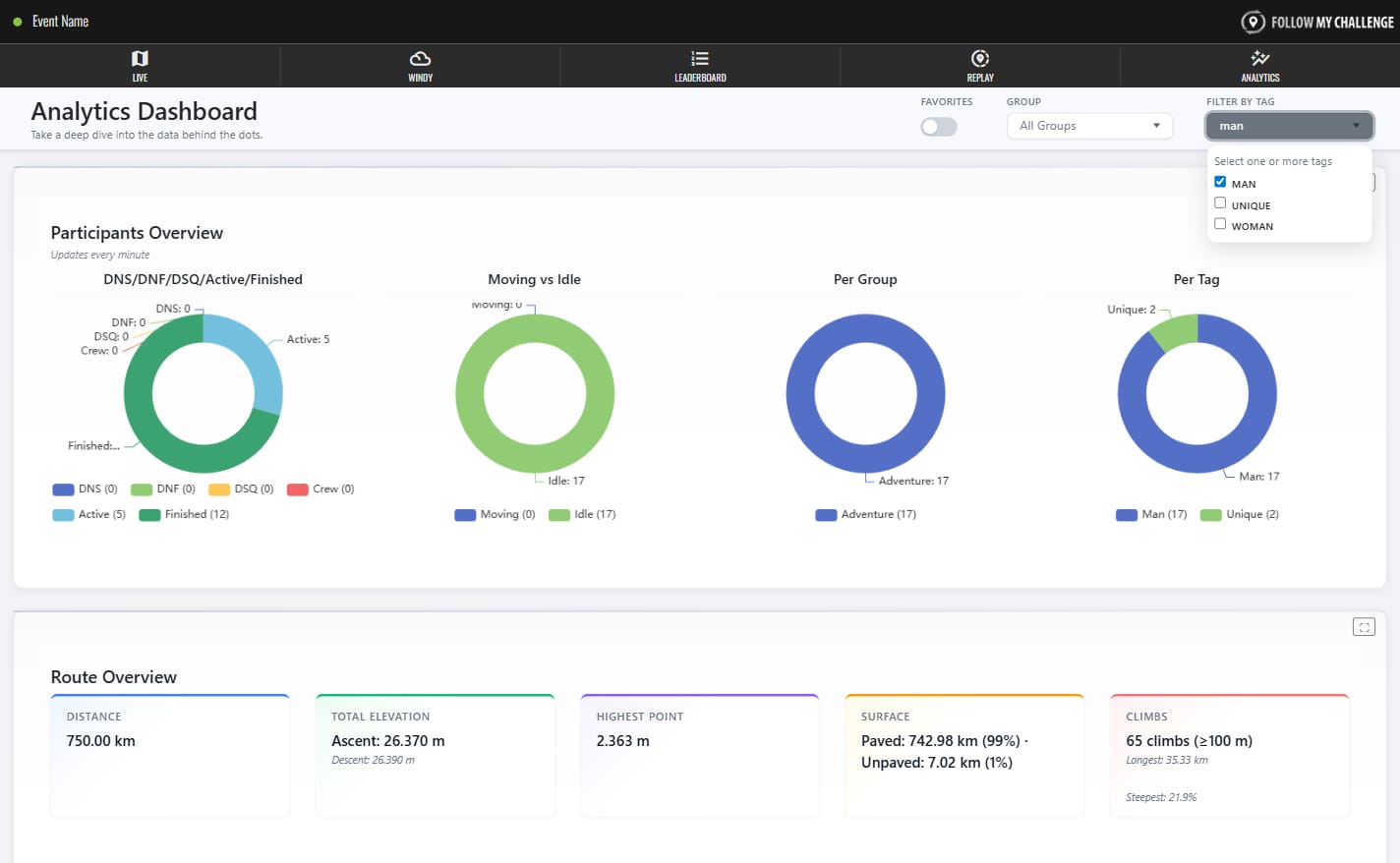
As events get bigger and our maps get more powerful, the need for better filtering of data becomes more pronounced. The top of the Analytics page includes filtering based on favourites, groups or tags. This instantly allows you to dive into the data that you care about.
Tag filtering is particularly important as this is most commonly used for gender tags. In events that have open classifications, this will allow you to draw direct comparisons between participants of the same gender.
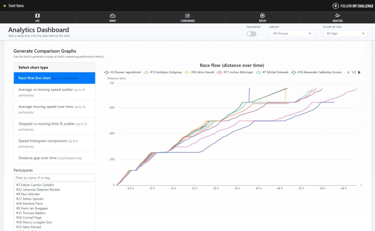
Interactive graphs
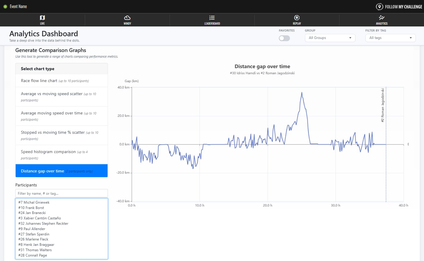
Why have one fixed graph when you can six interactive ones? Our static race flow chart has been gracefully retired and replaced by this powerful graph tool. You can choose from a range of comparative charts, selecting the participants you want to compare as well as quickly populating with pre-set top 10s.
These charts include a number of brand new ones that bring a totally new perspective to how the race played out. For example, the distance gap over time chart can show you exactly what the gap between two participants looked like from the start line until the finish – potentially showing where the winner finally snapped the elastic.
Improved mobile performance
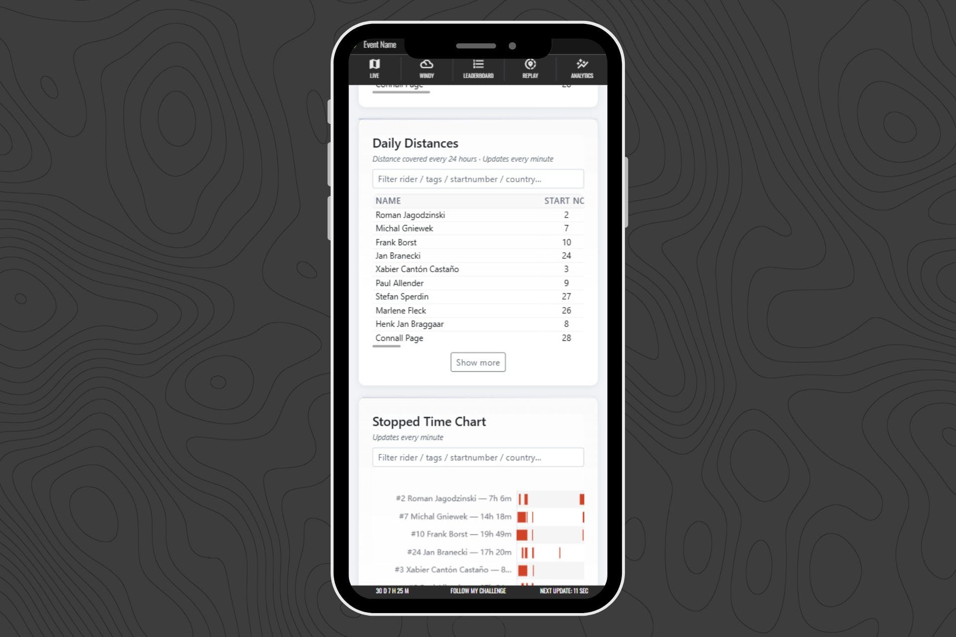
With most users visiting on mobile, the new Analytics tab has been redesigned to perform significantly better on smaller devices. While analytics content is inherently data-rich, the new page is much lighter.
It focuses on comparisons and smaller default datasets rather than loading everything at once, improving speed and responsiveness. The mobile-optimised layout also makes charts and tables easier to browse, even on compact screens.