As the trickle of events will soon start to turn into a flurry and dotwatching becomes ever more gripping, it seems a good time to highlight a selection of new features that we have developed over the winter. These include adding functionality to the platform, improving support and extending existing features.
Many of the new developments are based on requests and feedback from last year. If you have a feature you would like to see added or amended, you can request it here.
Brand New Replay Tab
This new replay feature integrates our iconic vector mapping layer for the first time, as well as introducing a host of new controls. Designed with larger events in mind, it includes additional filters and search options for ease of use, as well as a more intuitive feel and layout.
These are some of the key features of the new replay tab:
- Detailed vector layers to match our live maps
- Automatic 3D rendering when you tilt the map view
- Optional trails that grow as the replay progresses
- Show/hide participants based on status or group
- Search for participants by name or number
- Surface detection for routes now shown on the replay layer
You can read more about our new replay tab on our support site here.
Checkpoint Pop-Ups
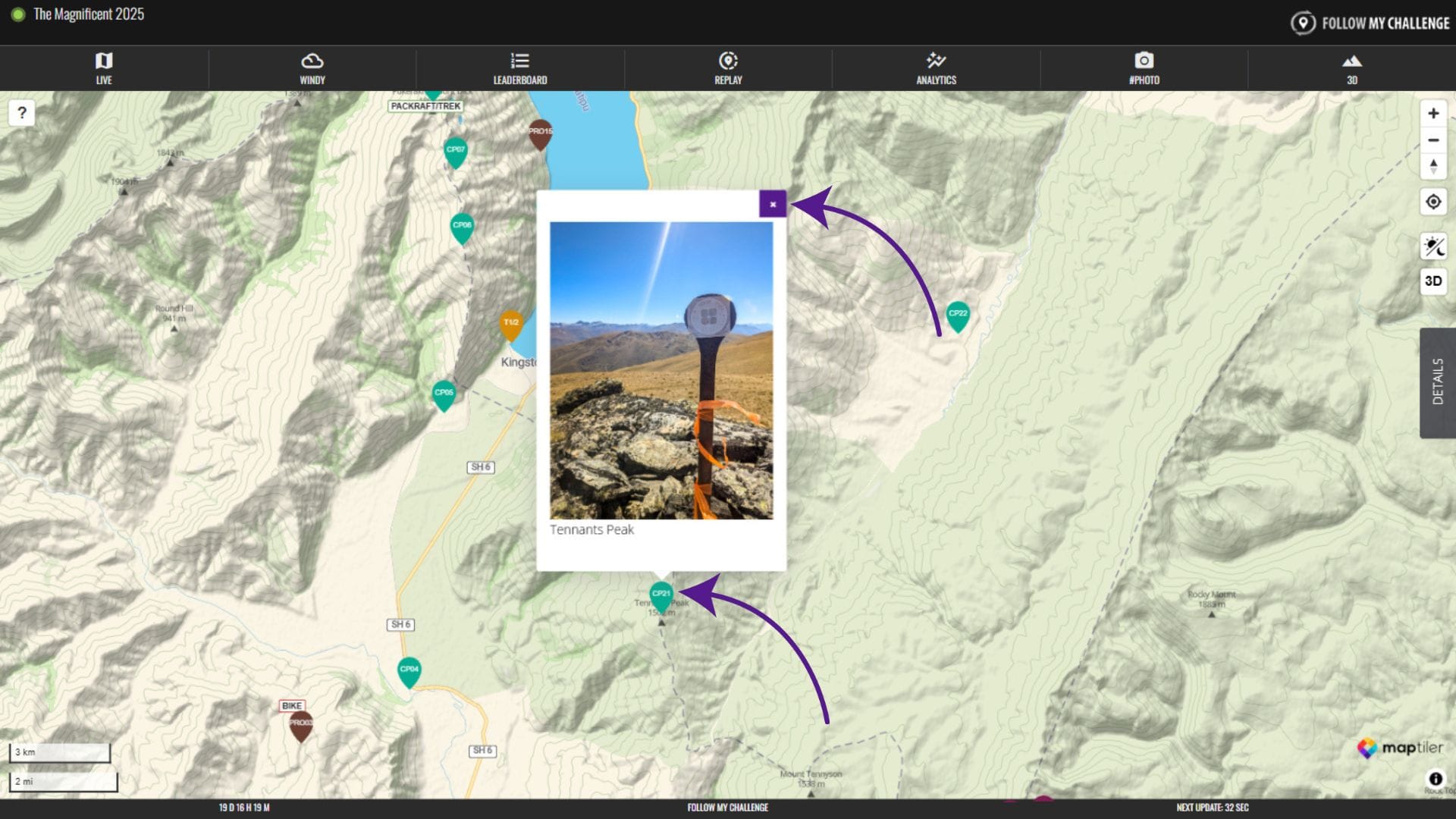
All new maps now have clickable checkpoint pop-ups enabled. These pop-ups appear beside the checkpoint when the checkpoint is clicked and can contain text, images or links.
Organisers can submit this content as part of the map build process, allowing for greater detail about the checkpoint and where it is located. To close the pop-up, simply click on the “x” in the top right corner.
Unit preferences
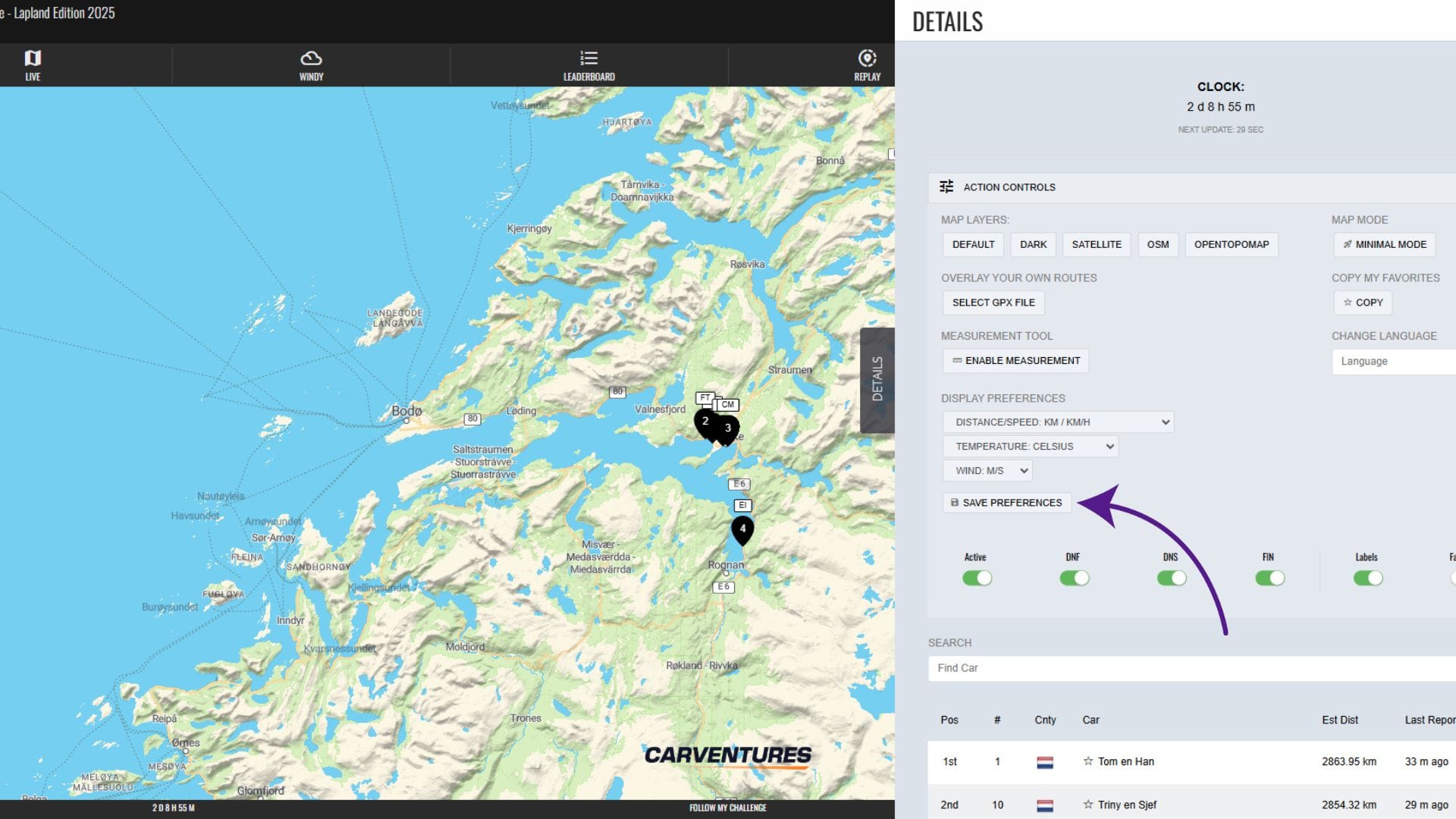
We’ve added the ability to control units of measurement within your browser, meaning all those dotwatchers who prefer imperial measurements are now able to switch.
To do this, head to the Action Controls section of the Details menu. Here, the display preferences allow you to change the units of measurement used on the map, switching between the imperial or metric system. You can customise distance, temperature and wind speed units independently of each other. To save your choices, click on “Save Preferences”.
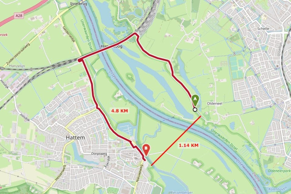
Distance Measurement Tool Added
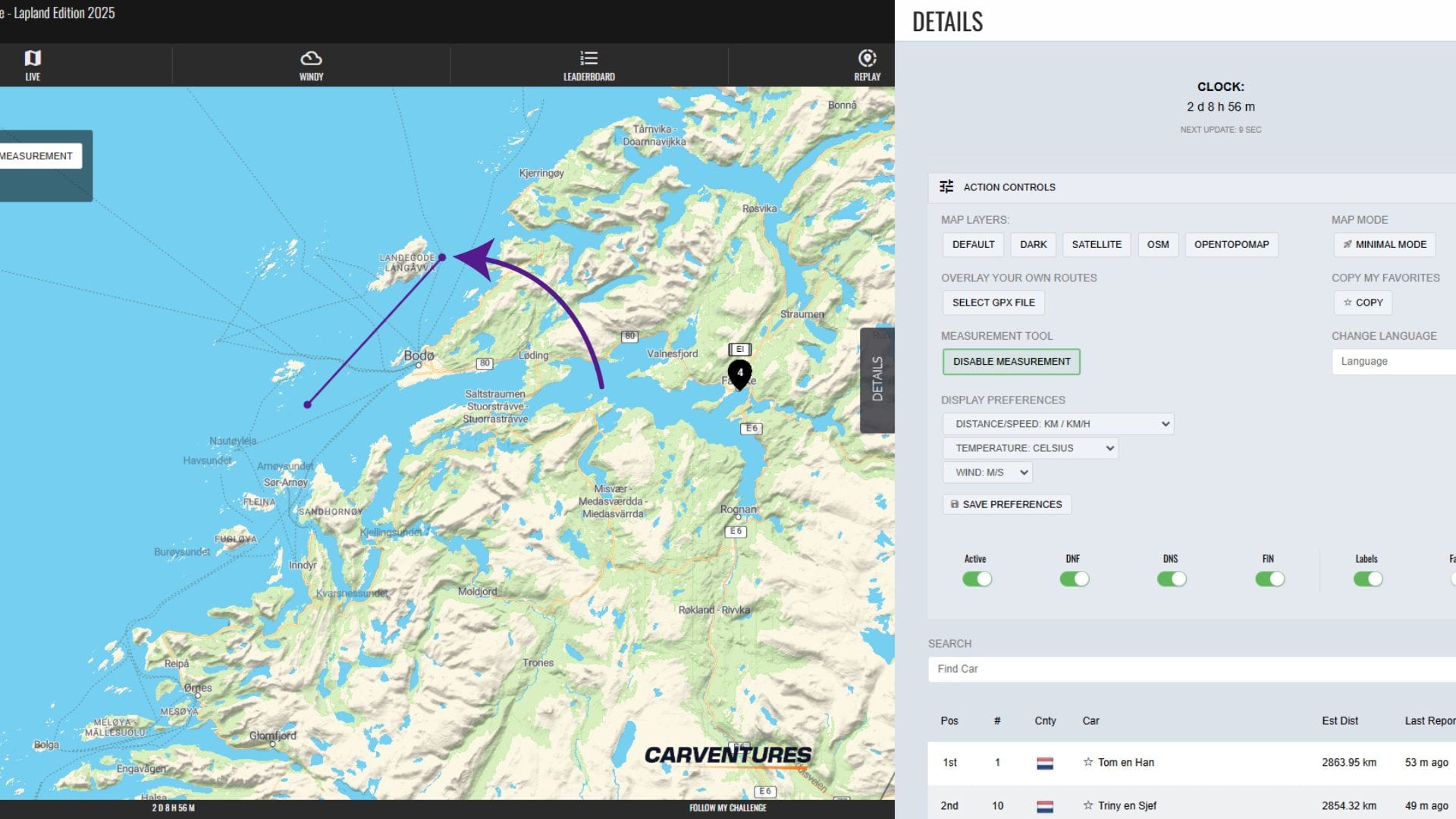
Curious to know the straight line distance between two dots? We’ve now added a distance measurement tool, which you can find in the Action Controls menu in the Details tab. This allows you to draw straight lines on top of the map, with the distance shown in an overlaid box in the top left.
Upgraded overdrive mode
Our existing “Overdrive Mode” feature takes advantage of our ability to remotely control our Queclink trackers, changing their update interval as participants approach the finish. Previously, this was set to switch to 1 minute intervals in the final 15 km.
Moving forwards, this will now adjustable between maps, allowing us to optimise for shorter events, where battery is less of a worry and an even shorter interval will give greater precision.
Profile tags (beta mode)
You may have noticed last year that several maps featured links to participants’ Instagram accounts in the Details menu and pop-up, e.g. The Transcontinental. We’re expanding this in 2025 to include more fields, including profile photos for some events, allowing you to gain a little more information about participants from the map, as well as find relevant links.
This feature is still being developed and it’s dependent on organisers being able to provide the relevant information, and in an appropriate format. But you will begin to see a number of events testing this new feature as we develop it further.
Support site
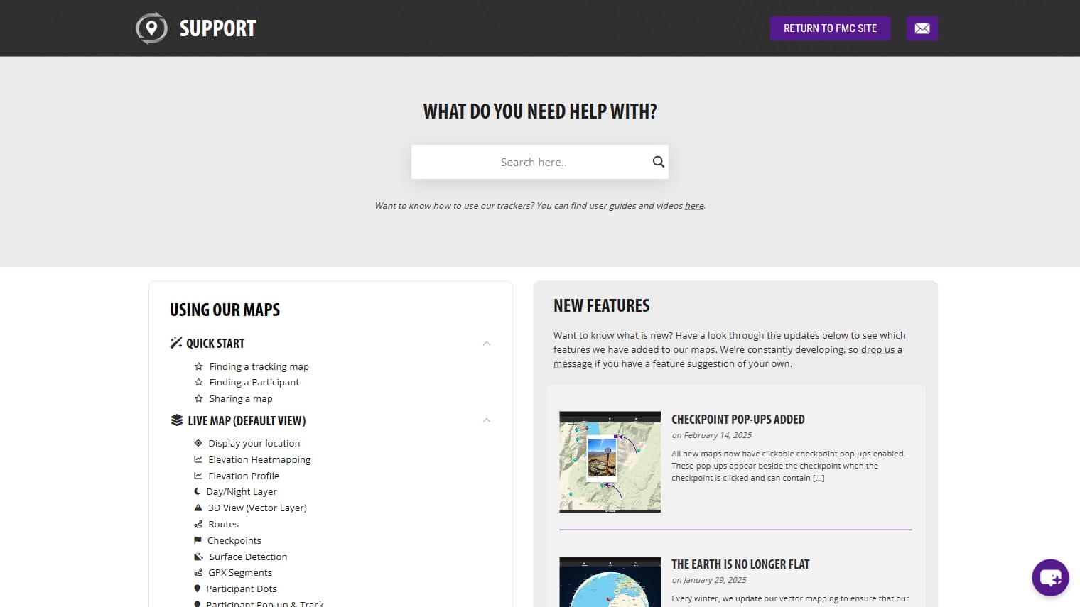
We’ve always aimed to make our tracking platform intuitive and easy to use, even for casual dotwatchers. As the platform evolves and gains more features, some tools may be less obvious. To help users navigate these updates and improvements, we’ve launched a support site with a clear structure and helpful screenshots that walk you through the various tabs, buttons, and layers on our maps.
The support site will be regularly updated as new features roll out, with major updates highlighted on the homepage and blog. If you ever need help or can’t find what you’re looking for, our new AI chatbot—accessible via the button in the bottom right—can provide instant answers, drawing on information from across our website and support site.
Check out the new support site here.
Globe view
It may just be a cosmetic change, but you will notice that the world is now a globe in our maps. Every winter, we update our vector mapping to ensure that our maps remain up to date, as well as to take advantage of the latest feature releases. This most recent update includes support for a globe view of the map as you zoom out, which we have quickly implemented.
You will now see that the curvature of the Earth appears as you begin to zoom out. In fact, you are able to zoom all the way out to view the Earth as planet against a starry sky behind. This new perspective is particularly impactful when tracking long events across multiple countries or continents.
More surface detail
Since early last year, all fixed route maps have had the option to display surface data by default, which is ideal for mixed-surface and off-road events. Over the winter, we’ve enhanced this further to display additional information where it is available. Hovering on an unpaved (marked by dashes) section will now bring up extra details such as the name and track type (where they exist in the source data).